Balancing Your Layout

Balancing the space on a 12×12 layout can be daunting…there is so much area to think about in a 12×12 ratio.  If you can imagine grid lines on your paper, the grid lines will help you organize the elements on your page according to the sections of the grid you are populating with design elements.  The cool thing about “we scrapbookers” is that we can usually see with our eye what “looks good” and what doesn’t.  Once again, I will repeat myself by saying: trust the experts.  Watch some of the pro’s on YouTube (like Shimelle Laine or MercyTiara) who will teach you some great tips and skills regarding design.

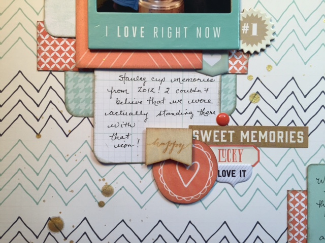
This layout shows how you can use a variety of clusters on your page to create an interesting layout.

acup1
For example, this picture of the layout shows a cluster at the bottom of the journaling card which completes the white space that was trapped in this area. It also draws the eye to the journaling itself.
acup3
The cluster in the top right corner balances that area and the layout in general.
acup5
Here is the finished layout. You can see that I have included clusters of embellishments at the corners of the two focus areas on the layout and then added the title on the horizontal line across the page. The bold patterned paper background on the bottom 2/3 of the layout features that fun paper by Crate Paper and the Craft Market collection. Have I mentioned how much I love Crate Paper??

Here is a link to the Process Video:

Advertisement

One thought on “Balancing Your Layout

  1. Awesome tips! This is hard for me and I struggle, I usually just go with what I think looks good, but then again we are our own worse critics! So glad I found your blog!

    Like

Leave a Reply

Fill in your details below or click an icon to log in:

WordPress.com Logo

You are commenting using your WordPress.com account. Log Out /  Change )

Facebook photo

You are commenting using your Facebook account. Log Out /  Change )

Connecting to %s